这一章中说明所有剩余的常用多元素布局,包括Flow、Wrap、ListView等。
Flow布局
Flow流布局可以认为是一种自定义布局方式,它可以根据不同效果来进行布局展示,只不过更多情况下是用来实现流式布局效果。
Flow是一种很高效的布局方式,主要是因为通过转换矩阵对子控件进行调整,而且默认配置下,调整布局时,只是进行重绘,并没有实际调整其位置。
布局规则
Flow布局必须要指定一个FlowDelegate,所有的布局效果都是通过FlowDelegate中设置的。下面分别说明下FlowDelegate 的各个方法,分别在Flow布局中起到什么作用。
Size getSize(BoxConstraints constraints)设置控件大小,也就是子控件可用的布局大小。默认使用约束中的最大值。BoxConstraints getConstraintsForChild(int i, BoxConstraints constraints)设置子控件约束,i表示子控件下标;constraints 为 父控件透传的约束。默认使用该约束信息。注意,如果使用其它约束内容,需要重写shouldRelayout方法。bool shouldRelayout(covariant FlowDelegate oldDelegate)设置什么情况下需要调整子控件的位置,默认情况下永远也不需要调整,这也是优化的一个原因。void paintChildren(FlowPaintingContext context)对子控件进行绘制,注意这个方法是抽象的,必须要重写。这个方法里可以通过context.paintChild来进行绘制每个子控件。bool shouldRepaint(covariant FlowDelegate oldDelegate)需要重绘时,该值设置为true,注意该值设置为false也有可能触发绘制流程,比如触发重布局操作等。这个方法也是抽象的,必需重写。
上面FlowDelegate的所有方法共同决定了Flow的布局效果。可以看下下面的使用示例。
布局示例
1 | class MyFlowPage extends StatefulWidget { |
界面效果如下:
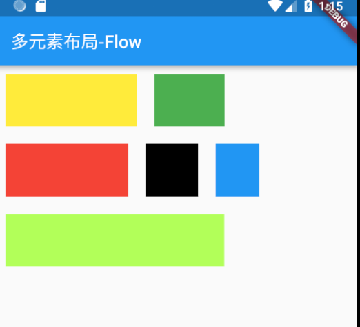
这个示例也是Flow流布局最常用的效果。
Wrap布局
Wrap可以认为也是类似于Flex的效果,与Row、Column非常相似。只不过Wrap能够支持多行多列,当主轴上的空间不足时,自动向交叉轴方向上去扩展。
属性说明
- direction 主轴方向,默认为水平方向
- alignment 主轴方向的对齐方式,默认为start起始位置,枚举类型,与Flex的对齐方式一样。
- spacing 主轴方向上子控件之间的间距
- runAlignment 交叉轴方向上每一行(或一列)的对齐方式。有点绕口,不过这个不是交叉轴方向上的对齐方式。
- runSpacing 交叉轴方向上一行(或一列)的间距
- crossAxisAlignment 交叉轴方向上子控件的对齐方式
- verticalDirection、textDirection 与Flex参数一致,分别表示垂直方向start、end设置;文本对齐方式
布局规则
流式布局效果,先在主轴上进行填充,主轴上不可放置则在交叉轴方向上另起一行(或一列),重新在主轴方向上填充。
具体效果参见Flex、Flow,不再详细说明。
布局示例
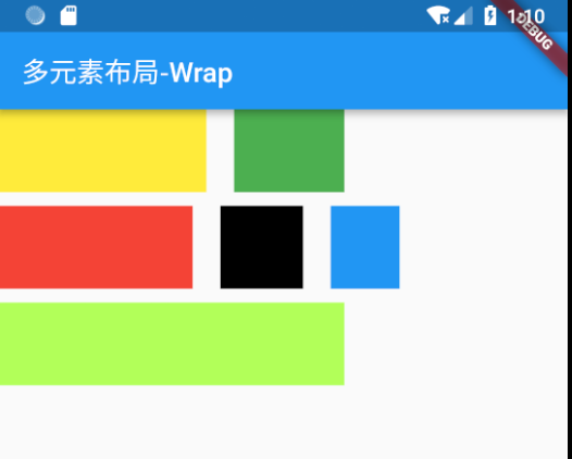
如果要达到之前Flow示例效果,可以采用如下的方式:
1 | child: Wrap( |
界面效果如下:
ListView布局
ListView布局可以说是使用最多的一批布局效果,所有的列表展示都可以通过ListView进行布局。相比Flex方式(Row、Column),在主轴方向上不限于父控件约束,也就是说可以在主轴方向上设置了ScrollView,可以滑动进行展示。
ListView创建方式
ListView有两种常用的创建方式,第一种是直接将所有子控件一一列出,赋值给children,使用常用构造方法:
1 | ListView({ |
另一种方式是通过Builder创建,子控件通过WidgetBuilder创建,使用Builder构建方法:
1 | ListView.builder({ |
这两种的区别是,第一种更简单直观一些,适用于固定的列表项,而第二种更灵活一些,适用于未知的列表项。
需要注意的是两种的核心处理是一致的,不像有些文章说的,ListView构造方法需要一次性渲染所有的控件,而Builder只有在展示时才会渲染。事实上两个都是展示时才会渲染的,这样可以尽量避免内存溢出的情况。
部分字段说明
由于ListView字段较多,下面只说明了部分字段:
- scrollDirection 滚动方向,也就是主轴方向
- reverse 滚动方向是否为阅读方向,从Scroll集成的字段
- controller 滚动控制,可以设置滚动位置,滚动效果等
- cacheExtent 视口在可见区域之前和之后有一个区域,用于缓存用户滚动时即将可见的项目
- shrinkWrap 常用于内容大小不确定情况,如果为false,则滚动视图将扩展到允许的最大大小。如果是无界约束,则 shrinkWrap 必须为 true.默认设置为false.
实际上ListView中各字段基本都与ScrollView一致。
ListTile
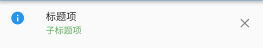
ListTile是一个固定格式的一行内容,常用来在ListView中进行每一项的展示使用。
有如下内容:
- leading 最左侧的部分,Widget类型,一般设置图标。
- title 标题项,Widget类型,一般设置文本。
- subtitle 子标题,与title类型相同。
- trailing 最右侧的部分,Widget类型
- onTap 点击事件
- onLongPress 长按事件
示例如下:
1 | ListTile( |
結果:
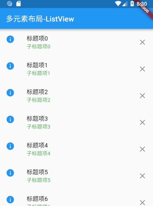
使用示例
1 | return Scaffold( |
布局效果:
GridView布局
GridView 是网格形状布局,与ListView一样,继承自 BoxScrollView,所有很多特性都是类似的。
创建方式
count方式
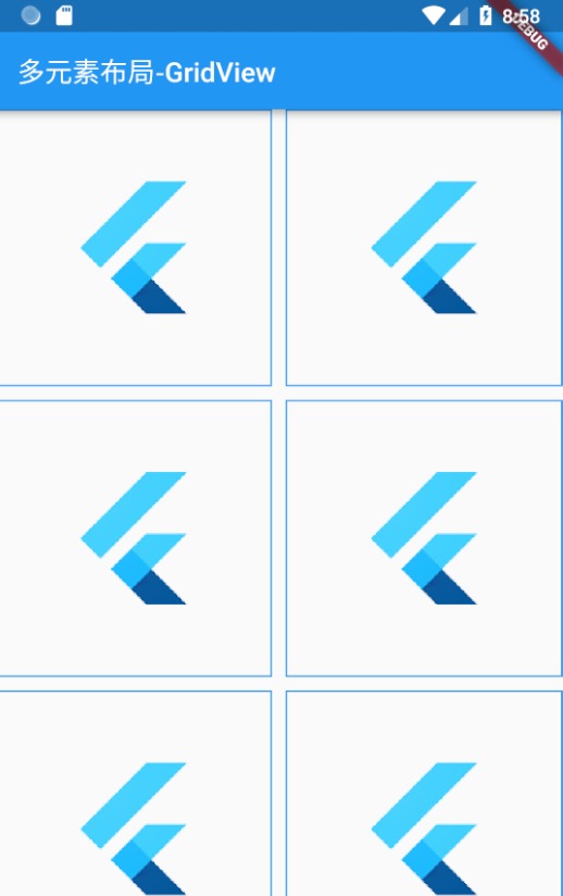
采用GridView.count来创建GridView,这种方式指定了网格形状在交叉轴方向(也就是竖轴方向)上分配几个控件。具体个数由crossAxisCount来指定。示例如下:
1 | GridView.count(crossAxisCount: 2, |
结果:
extent方式
采用GridView.extent来创建GridView,这种方式指定了交叉轴方向上每个控件的最大尺寸,由此给出一个合适的适配效果。通过maxCrossAxisExtent这个字段来设置。
具体示例不再说明。
其它方式
最主要的就是上面两种,但是还有一些其它创建方式,比如原生构造方式、builder方式、custom方式,基本都是通过网格布局代理以及子控件代理方式实现,没有太大的区别。